
Single-cell genomics for machine learning practitioners#

This is a primer for people who are comfortable with machine learning but new to the biology. It covers what single-cell data is, how it is stored, what makes it awkward to model, and the preprocessing that usually comes first.
The biology behind the numbers#
Every cell in a body carries the same DNA. What makes a neuron different from an immune cell is which genes each one uses. A cell uses a gene by transcribing it into messenger RNA (mRNA), a working copy that the cell reads to build a protein. The more copies of a gene’s mRNA are present, the more strongly that gene is expressed.
Single-cell RNA sequencing (scRNA-seq) measures exactly this. It isolates individual cells, captures the mRNA inside each one, and counts how many molecules of each gene it finds. The result is a table: one row per cell, one column per gene, and each entry the number of mRNA molecules of that gene seen in that cell. A human dataset has thousands to millions of cells and around 20,000 genes.
That count table is the raw material for everything that follows. The biological signal we care about, such as a cell’s type or state, is written in the pattern of which genes are switched on and by how much.
Setup#
On Google Colab, run the install cell once. Locally, skip it if the packages are already present. The data loader further down downloads a ~1.9 GB dataset from CELLxGENE the first time it runs and caches it under ../data/, so later runs (and the other notebooks) reuse the same file.
import IPython

# Setup environment: run this cell once.
try:
    import scanpy as sc
    import igraph
    import leidenalg
    import ggml_ot
    print("All dependencies are installed and loaded successfully!")
except ImportError:
    print("Required packages not found. Installing now...")
    ipy_v = IPython.__version__
    print(f"Protecting the current IPython version (v{ipy_v})...")
    %pip install -q "scanpy" "igraph" "leidenalg" "ggml-ot==0.9.93" "ipython=={ipy_v}"
    print("Installation complete! Restart the kernel to load new packages.")
All dependencies are installed and loaded successfully!
import warnings
warnings.filterwarnings("ignore")

import scanpy as sc
import ggml_ot
%matplotlib inline

sc.settings.verbosity = 0
print("CHECKPOINT 1/3 - Setup complete")
CHECKPOINT 1/3 - Setup complete
The data#
Single-cell data is stored as an AnnData object, which keeps the expression matrix and all of its metadata together in one place.

The layout mirrors the experiment:
Observations are the cells and form the rows. Per-cell metadata (a cell-type label, the donor a cell came from, quality metrics) lives in
.obs, a table with one row per cell.Variables are the genes and form the columns. Per-gene metadata (the gene symbol, whether the gene was selected as informative) lives in
.var, a table with one row per gene.The expression values themselves, the cells-by-genes matrix, are held in
.X.
Rather than a toy dataset, we use a real study: a single-cell atlas of the human heart after myocardial infarction (Kuppe et al., 2022). It profiles the left ventricle of 20 donors, some recovering from an infarct and some healthy controls, for about 190,000 cells spanning the major cardiac cell types. We pull it from CELLxGENE with load_cellxgene, which caches the file under ../data/, and subsample it so the rest of the notebook stays responsive. The raw integer counts are kept in .raw, and the .X matrix has already been normalized.
dataset_id = "c1f6034b-7973-45e1-85e7-16933d0550bc.h5ad"
adata = ggml_ot.data.load_cellxgene(dataset_id, path="../data/")

# Subsample from ~190k cells to speed up tutorial
sc.pp.subsample(adata, n_obs=15000, random_state=0)

# The dataset uses Ensembl gene IDs by default, here we use the gene symbols as names for readability
adata.var_names = adata.var["feature_name"].astype(str)
adata.var_names_make_unique()
print(f"CHECKPOINT 2/3 - Data loaded: {adata.n_obs:,} cells x {adata.n_vars:,} genes")
adata
CHECKPOINT 2/3 - Data loaded: 15,000 cells x 28,975 genes
AnnData object with n_obs × n_vars = 15000 × 28975
    obs: 'sample', 'n_counts', 'n_genes', 'percent_mito', 'doublet_score', 'dissociation_score', 'cell_type_original', 'patient_region_id', 'donor_id', 'patient_group', 'major_labl', 'final_cluster', 'assay_ontology_term_id', 'development_stage_ontology_term_id', 'disease_ontology_term_id', 'self_reported_ethnicity_ontology_term_id', 'is_primary_data', 'organism_ontology_term_id', 'sex_ontology_term_id', 'tissue_ontology_term_id', 'cell_type_ontology_term_id', 'suspension_type', 'tissue_type', 'cell_type', 'assay', 'disease', 'organism', 'sex', 'tissue', 'self_reported_ethnicity', 'development_stage', 'observation_joinid'
    var: 'feature_is_filtered', 'feature_name', 'feature_reference', 'feature_biotype', 'feature_length'
    uns: 'X_approximate_distribution', 'batch_condition', 'cell_type_original_colors', 'citation', 'default_embedding', 'schema_reference', 'schema_version', 'title'
    obsm: 'X_harmony', 'X_pca', 'X_umap'
# .X is the normalized matrix, and the raw integer counts are preserved in .raw
print("matrix shape (cells x genes):", adata.shape)
print("a corner of the raw counts:\n", adata.raw.X[:4, :6].toarray())

#  .obs contains cell annotations like cell type, donor, disease, QC metrics
adata.obs[["cell_type", "donor_id", "disease", "percent_mito"]].head()
matrix shape (cells x genes): (15000, 28975)
a corner of the raw counts:
 [[0. 0. 0. 0. 0. 0.]
 [0. 0. 0. 0. 0. 0.]
 [0. 0. 0. 1. 0. 0.]
 [0. 0. 0. 0. 0. 0.]]
| cell_type | donor_id | disease | percent_mito | |
|---|---|---|---|---|
| GGCTTGGAGAGGGCGA-1_2_1_1_1_1_1_1 | fibroblast of cardiac tissue | P9 | myocardial infarction | 0.301023 |
| AACGAAACAAACTCGT-1_1_1_1_1_1_1_1_1_1_1 | pericyte | P6 | myocardial infarction | 0.118694 |
| TACGGGCCACGCCACA-1_1_1_1_1_1_1_1_1_1 | cardiac muscle myoblast | P8 | normal | 0.070655 |
| GAAGTAATCTCGCTCA-1_2_1_1_1_1_1_1_1_1 | cardiac muscle myoblast | P2 | myocardial infarction | 0.021791 |
| TCTACCGTCCTCTCGA-1_1_1_1_1_1_1_1_1_1_1_1_1_1_1 | fibroblast of cardiac tissue | P1 | normal | 0.198020 |
Properties of single-cell datasets#
A count matrix looks like an ordinary feature matrix, but it has properties that shape every modelling choice.
Cells fall into discrete types#
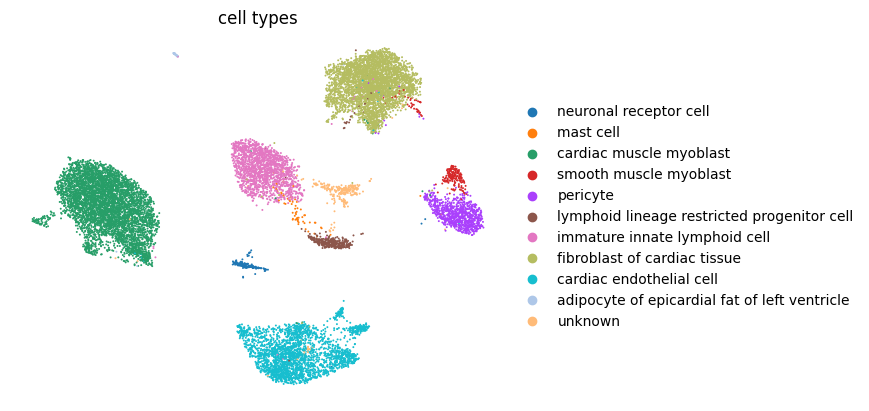
Cells of the same type express a similar set of genes, so they sit close together in expression space and separate into discrete groups, which an ML eye reads as clusters and biologists label as cell types. The dataset ships with its own UMAP embedding and cell-type annotation, which we plot here. (That shipped embedding is already batch-corrected across donors, which is why the groups look this clean. We rebuild a raw one straight from the counts further down, and revisit what “batch-corrected” means in the last section.)
sc.pl.embedding(adata, "X_umap", color="cell_type", title="cell types", frameon=False)
Genes act in programs#
Genes do not vary independently. They act in programs: the set of genes that defines a cell type tends to switch on together. Because those genes are high in the same cells, their columns rise and fall together across the matrix, so many genes are strongly correlated and the data’s true dimensionality is far lower than its gene count. This is why a linear reduction like PCA works well as a first step.
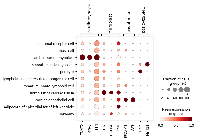
The dot plot below shows a few marker genes, grouped by the cell type they label, against the annotated cell types. Dot size is the fraction of cells expressing the gene and colour is the mean expression. Each group lights up in essentially one cell type: that co-expression is what makes the genes within a program correlated.
# marker genes grouped by the cardiac cell type they label
marker_groups = {
    "cardiomyocyte": ["TNNT2", "MYH6", "TTN"],
    "fibroblast":    ["DCN", "PDGFRA", "GSN"],
    "endothelial":   ["PECAM1", "VWF"],
    "pericyte/SMC":  ["RGS5", "MYH11"],
}

# use_raw=False so the symbols match .var_names (raw still holds Ensembl IDs)
sc.pl.dotplot(adata, marker_groups, groupby="cell_type",
              standard_scale="var", use_raw=False)
Cell annotation can live at the sample level#
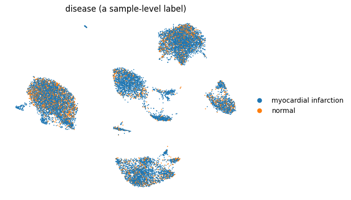
Not every label is per cell. Often the quantity of interest belongs to the whole sample. Here the key label is disease: each heart is either recovering from a myocardial infarction or a healthy control. That is a property of the donor, not the individual cell. Every cell from an infarcted heart carries the same disease value, stored in .obs and repeated across all of that donor’s cells, beside the per-cell cell_type. A model may therefore predict a property of a single cell (its type) or a property shared by a whole group of cells (the donor’s disease status), and the two need different framings.
Painting that label onto the embedding makes the difference visible: unlike cell_type, which varies from cluster to cluster, every cell simply inherits its donor’s disease status.
# show embedding coloured by a sample-level obs: disease is shared by every cell from a donor
sc.pl.embedding(adata, "X_umap", color="disease",
                title="disease (a sample-level label)", frameon=False)
The measurement is sparse and noisy#
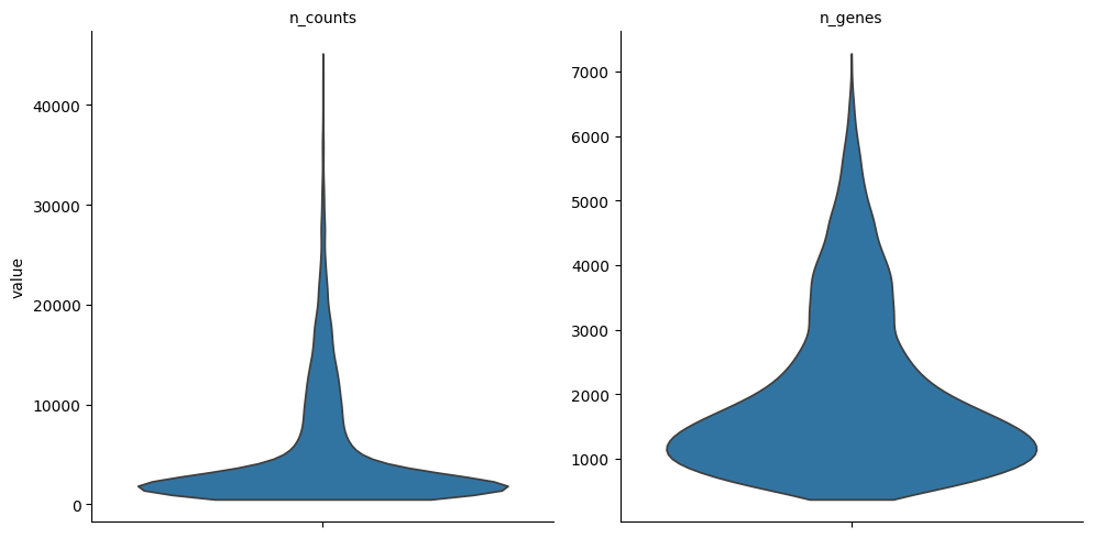
The matrix is well over 90% zeros. A zero can arise for more than one reason: the gene may simply be off in that cell, or it may be expressed but its few mRNA molecules were not captured or sequenced deeply enough to register. How much each reason contributes is still debated, but the practical consequence is the same: low counts are unreliable. Sequencing depth adds a second effect. Some cells are read more deeply than others for purely technical reasons, which scales all of their counts up or down. Neither the sparsity nor the depth variation is what we want to model, and much of preprocessing exists to limit their influence. The violins show how much the depth (n_counts) and the number of detected genes (n_genes) vary from cell to cell.
# quantify how sparse the matrix is
counts = adata.raw.X
frac_zero = 1 - counts.nnz / (counts.shape[0] * counts.shape[1])
print(f"fraction of zero entries: {frac_zero:.1%}")

# depth (n_counts) and detected genes (n_genes) are already in .obs, so scanpy plots them directly
sc.pl.violin(adata, ["n_counts", "n_genes"], multi_panel=True, stripplot=False)
fraction of zero entries: 93.1%
Typical preprocessing#
The .X here is already normalized, but to show what that involves we start again from the raw counts in .raw. A fairly standard pipeline makes cells comparable and shrinks the matrix to a manageable size:
Quality control. Drop cells with too few detected genes and genes seen in too few cells. Real pipelines add more, such as removing high-mitochondrial (damaged) cells and likely doublets, which is why this dataset already carries
percent_mitoanddoublet_score.Normalization. Scale each cell to a common total count to reduce the depth differences above, then
log(1 + x)to compress the range. It’s a convention, not the only option: it assumes cells hold similar total RNA, and count-based models skip it. The+1is a pseudocount. Shrinking it keeps more low-expression signal but amplifies noise, solog1pkeeps it at 1.Feature selection. Keep the couple of thousand most variable genes.
Scaling. Z-score each gene (subtract mean, divide by standard deviation) so a few high-magnitude genes don’t dominate PCA, clipping (here at 10) to limit outliers.
Dimensionality reduction. Reduce to a few dozen principal components, which capture most of the variation and are one common thing to hand a model.
# start again from the raw counts kept in .raw
adata_pp = adata.raw.to_adata()
adata_pp.var_names = adata.raw.var["feature_name"].astype(str)
adata_pp.var_names_make_unique()
adata_pp.obs = adata.obs

sc.pp.filter_cells(adata_pp, min_genes=200)
sc.pp.filter_genes(adata_pp, min_cells=3)

sc.pp.normalize_total(adata_pp, target_sum=1e4)
sc.pp.log1p(adata_pp)

sc.pp.highly_variable_genes(adata_pp, n_top_genes=2000)
adata_pp = adata_pp[:, adata_pp.var.highly_variable].copy()

sc.pp.scale(adata_pp, max_value=10)
sc.tl.pca(adata_pp, n_comps=50)
Clustering and visualization#
A common next step, and a good sanity check, is to group the cells by expression and look at the result. We build a neighbour graph on the principal components, cluster it with the Leiden algorithm, and embed the same graph in two dimensions with UMAP for plotting.
sc.pp.neighbors(adata_pp, n_neighbors=10)
sc.tl.leiden(adata_pp, resolution=0.5, flavor="igraph", n_iterations=2, directed=False)
sc.tl.umap(adata_pp)

sc.pl.umap(adata_pp, color="leiden", title="Leiden clusters", frameon=False)
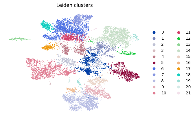
These clusters were found without any labels, purely from expression. Matching them to known marker genes is how the named cell types earlier are produced.
What you feed a model is itself a choice, and all three options live in the same AnnData object:
Raw counts (
.Xor a.layersentry): for count-based models such as autoencoders with a Poisson or negative-binomial likelihood, which model the noise themselves.Processed expression (normalized, log-transformed
.X): a general-purpose input, and what the tutorials that follow use.A reduced representation (
.obsm["X_pca"]): compact and denoised, used by classical methods and for building the neighbour graph.
Which one you pick is part of the modelling decision, not a fixed step.
Batch effects: the confounder to watch#
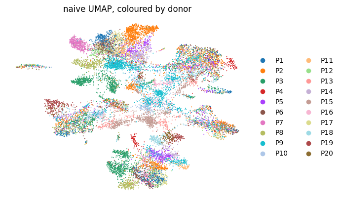
The 20 donors are not just extra cells. Each donor, sequencing run, or processing batch leaves a technical fingerprint on the counts. This batch signal sits on top of the biology, is usually the single largest source of unwanted variation, and a model left to its own devices will happily learn the donor instead of the cell type.
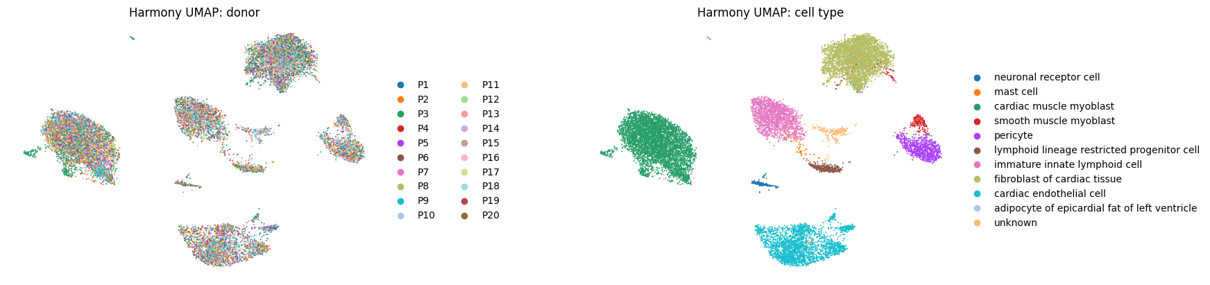
We can see it directly. The naive UMAP we just built groups cells partly by donor. The dataset also ships a Harmony-integrated embedding, where that donor signature has been removed and cells group by type instead. Comparing the two makes the effect obvious.
# BEFORE integration: the naive pipeline from above, coloured by donor
sc.pl.umap(adata_pp, color="donor_id", title="naive UMAP, coloured by donor", frameon=False)

# AFTER integration: the dataset's Harmony-corrected embedding, donor next to cell type
sc.pl.embedding(adata, "X_umap", color=["donor_id", "cell_type"],
                title=["Harmony UMAP: donor", "Harmony UMAP: cell type"],
                frameon=False, wspace=0.4)
print("CHECKPOINT 3/3 - Analysis complete")
CHECKPOINT 3/3 - Analysis complete
Read the two embeddings together. In the naive UMAP cells clump by donor as much as by cell type, and that structure is batch, not biology. The Harmony UMAP shows the fix: the same cells group by type, with donors mixed. Two consequences follow:
Integration comes before modelling. Harmony, scVI, or BBKNN remove the donor fingerprint while preserving cell type. A common confusion: Harmony corrects the PCA embedding (
X_harmonyand the UMAP built on it), not the counts..Xand the raw counts stay untouched, so it changes where cells sit, not what was measured.Evaluation must respect batches. To test whether a model generalizes, say by predicting a donor’s
diseasestatus, hold out whole donors rather than splitting cells at random. A random split puts near-identical cells from one donor on both sides, so the score mostly measures memorization.
This is also why preprocessing is fit on the whole dataset at once rather than per split: the aim is one shared feature space, not separately processed halves.